

Introduction
It’s easy to get started with Microsoft Power Apps. You can go to make.powerapps.com, connect to your data, and have an app in five minutes. However, that doesn’t mean you will have an app that users will love to use.
Like any development platform — design matters— even for low-code applications. Especially with canvas Power Apps, which give you ultimate flexibility over app layout, navigation, control sizing, and other UX components. Design thinking is very important to give users a positive they will love.
Many of our customers began with Power Apps via citizen developers who build applications with little to no training. The resulting applications, while functional, are typically not pretty, and not optimized for performance.
The temptation for many makers, since Power Apps connects to more than 700 systems, is to jump in and start connecting to data and laying out screens without first designing the way the screens present for both utilization and visual impact. The end result is similar to what one of our customers termed a “third-grade science experiment.”

Why Design Matters
- Design communicates meaning — a good design makes an application intuitive and pleasant to use.
- Inconsistent design creates confusion and makes applications harder to use.
- Poorly designed Power Apps frustrate users, may hinder adoption of the platform and negatively affect return on investment.
- By investing in design thinking for Power Apps (especially important applications used by many people), you can create applications users love that deliver the polished experience of a professional application.

How Hitachi Solutions Embraces User Experience (UX) Design for Low-code Application Creation
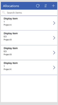
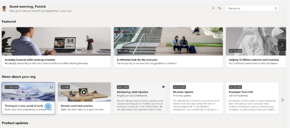
Our Power Platform Rapid Solutions Development (RSD) teams up and partners with Hitachi Solutions Advisory Services, User Experience (UX) division, to apply our proven UX Design Sprint approach to low code applications.
During this process, a UX designer and a Power Platform architect collaborate and conduct a series of remote workshops focusing on client business challenges and work to create alignment with client stakeholders. These collaborative workshops help both parties understand which parts of a customer’s business are most affected and why. They also help determine what metrics will drive business and/or user success and are designed to uncover user needs. The result — a “problem statement” focused on a single user/persona. The problem statement then serves as the foundation for the Design Sprint workshop.
The output from the workshops is a solution prototype, which is a functional wireframe of the working application’s built-in design tools— like Figma. Our team then tests the prototype with real users to validate its efficacy and usability, resulting in better business outcomes for our customers.
Benefits of UX Design Sprint
For moderately complex applications, the UX design sprint saves time by giving users a chance to test the user experience before building the application. It also allows the Power App developer to more quickly develop the application, as it gives them a specific screen, layout, and navigational guidance that has already been user validated.
For “citizen developer” focused customers with many makers building many applications, the UX design sprint also adds value by providing them clear examples of well-designed user experience that they can follow when building their apps, as well as setting the metaphor for themes, colors, logos, and other visual components. Administrators can then take the concepts designed in the UX design sprint, create reusable components and templates, and make it even easier for makers to create well-designed apps.
During this process, a Hitachi Solutions UX designer and a Power Platform architect conduct a series of remote workshops focusing on current business challenges and communicate with key company stakeholders to test and confirm the right solution.
These collaborative workshops help both parties understand which parts of our customers’ business are most affected and why. They also help determine what metrics will drive business and/or user success and are designed to uncover user needs. The result is a problem statement focused on a single user/persona. The problem statement serves as the foundation for the Design Sprint workshop.
The output from the workshops is a solution prototype, which is a functional wireframe of the working application built-in design tools like Figma. Our team then tests the prototype with real users to validate its efficacy and usability to confirm that path forward for our customers.
It’s getting even easier. Thanks, Microsoft!
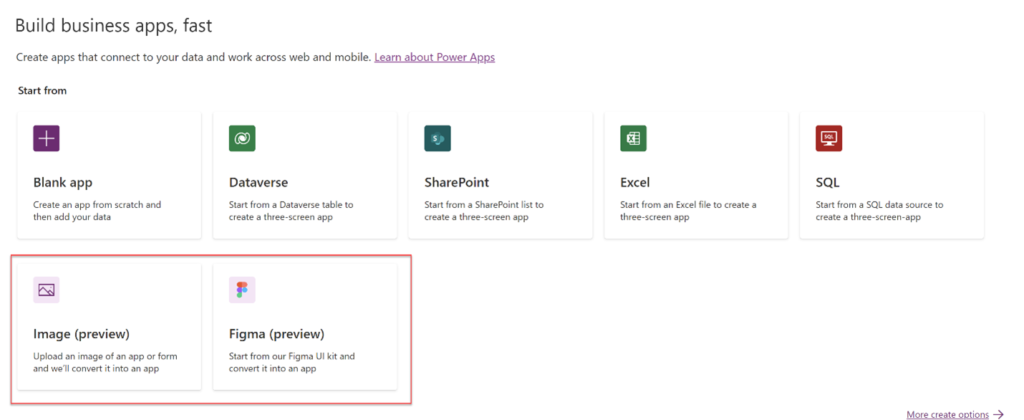
Last May during their annual Build conference, Microsoft announced a capability called Express Design (now in preview) to create applications from Figma designs and images. This means that we can now take the wireframe prototype screens produced during Hitachi’s UX design sprint and jumpstart the creation of the application, directly from the Figma wireframe. This makes taking the time to think through your app design before building even more valuable, as we can now directly turn that design into the starting point for your app.

What are Power Pages?
The Power of Design is at Your Fingertips with the Newest Member of the Power Platform Family.
Also announced at last month’s BUILD, Microsoft introduces Power Platform Pages, presently in preview. Formally Power Apps Portals, this low-code iteration for website maker-enabled web page creation and design give businesses the opportunity to build and manage their website through the Power Platform.
Some of the new enhancements in the preview:
- A modern design studio that is much easier to use, similar to Squarespace and Wix, and other modern website services.
- Dataverse columns and tables can now be configured from within the Power Pages data workspace, rather than leaving the portal designer and going to Power Apps to edit the data components.
- Power pages make working with site images much easier.
- A new template library–with Power Apps Portals, the starter templates all required Dynamics 365 Customer Engagement to use, but the Power Pages templates can be used by anyone.
You can give it a try at https://powerpages.microsoft.com. Microsoft has not yet announced the pricing for Power Pages.
Customer Question of the Month: “Can Power Automate for Desktop automate AS-400?”
CUSTOMER PROBLEM: Trying to automate your legacy applications, but some of them are mainframe applications, such as AS-400 applications.
CUSTOMER QUESTION: Can Microsoft’s RPA platform automate these systems?
HITACHI SOLUTIONS TECH HUB ANSWER: Yes it can. Power Automate for Desktop can natively attach to terminal emulators and send keys, set fields, get text, and wait for a terminal screen to appear.
You can get all of the text on a terminal screen or just text for a specific row starting at a fixed row/column number and defining the length.
This makes it very easy to work with AS-400 systems, send and retrieve data from them, and fully automate your processes
Send your customer question to [email protected] and see if it makes it into our next INSIGHTS!
Hitachi Solutions Blogger Highlights
- Hardit Bhatia
How to fix – Error when trying to retrieve data from the network | Hardit Bhatia: The Power Addict
Why Hitachi Solutions?
Hitachi Solutions helps its customers successfully compete with the largest global enterprises using powerful, easy-to-use, and affordable industry solutions built on Microsoft cloud services. Contact us today to get started!
P.S. Get a downloadable version of this blog here!


